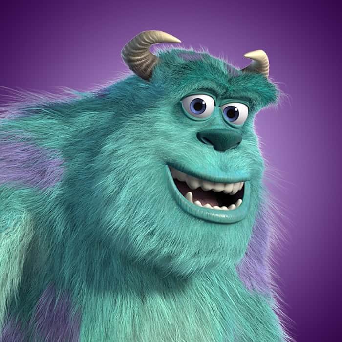
After the 5pm drop from the club ahead of the new season, I asked myself this one question: has Port Vale’s new 2026 away kit taken inspiration from Sully in Monsters, Inc.?
In the build-up to the announcement, the club posted on social media that the away socks would be on sale at 23:19 — a very specific time, but for those who don’t know, 2319 is an emergency code used when a monster is contaminated by contact with a human item.
Throughout the kit teaser posts, the colours of the iconic character Sully were also shown consistently across the marketing materials, and when the club released the Port Vale away kit for the 2026/27 season, it certainly drew many comparisons to the character due to the striking similarities.
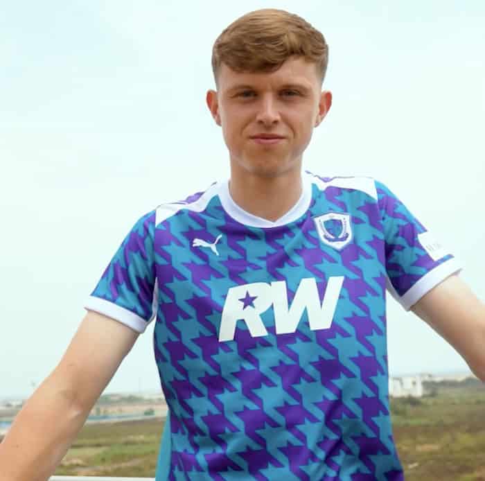
With its vibrant turquoise blue base and bold purple detailing, the shirt bears an uncanny resemblance to Sulley (or Sully), the lovable blue monster from Disney and Pixar’s Monsters, Inc.
Now, to be absolutely clear, there is no suggestion whatsoever that Port Vale or Puma officially based the design on the famous animated character. But once you’ve seen the colour combination, it’s difficult to unsee it.
This new collaboration of shirts is part of a brand-new sponsorship from lifelong fan and celebrity Robbie Williams, and what do I think of it?
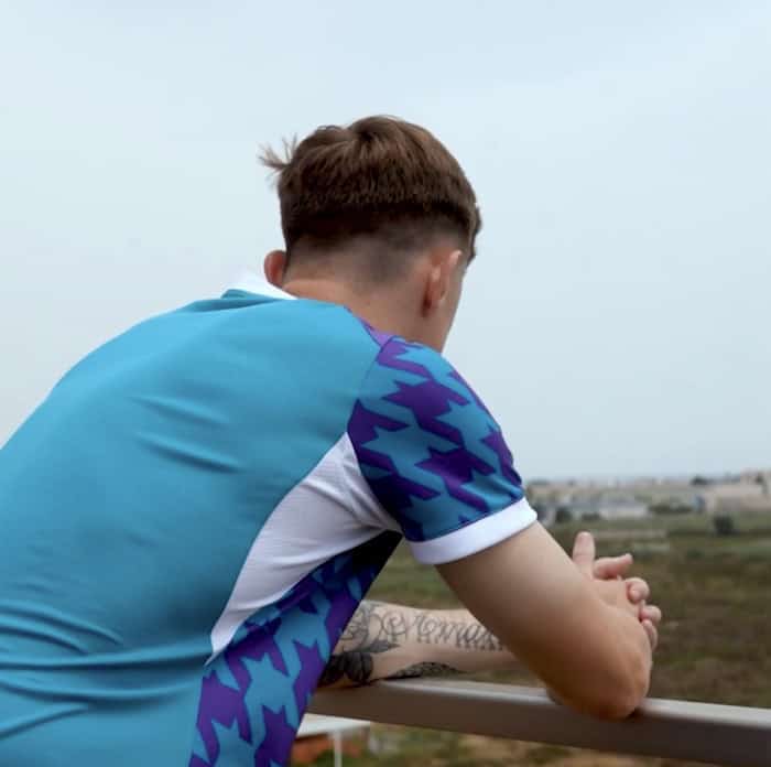
I’m not a fan, and I won’t be buying one, but I think over time it’ll grow on me. At the moment, I do feel like we had a competition with Stoke City for who could design the most unusual kit in the Potteries. What I will say is that the goalkeeper kits that the club released earlier today (especially the yellow one) are outstanding. I’ll be scooping up a yellow one the second they’re available.
The weird geometric shapes on the top aren’t as bad as I was expecting, but the badge has been completely muted, and that’s a real shame. When the badge is ruined on a football shirt, the shirt isn’t too far behind it. It needs to stand out loud and proud, not hide away and blend in.
Football has produced its fair share of iconic shirts over the years, from fluorescent goalkeeper jerseys in the 1990s to eye-catching geometric patterns and bold neon designs. Compared to some of those, Port Vale’s latest away strip is relatively understated — but the distinctive colours will divide fans immediately.
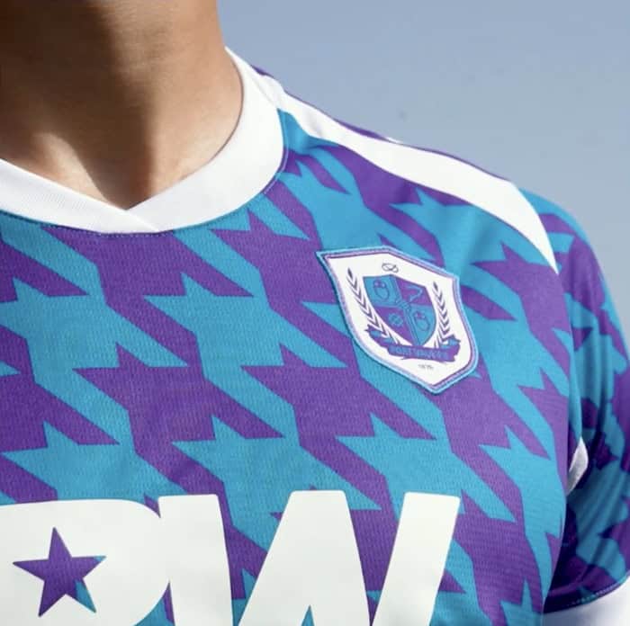
Whether supporters love it or not, the new away kit has achieved one important objective: people are already talking about it.
In an era where football shirt launches can easily disappear into a sea of template designs, standing out is half the battle. The turquoise and purple combination certainly ensures Port Vale’s players won’t blend into the background when they take to the pitch away from Vale Park.
The shirt continues Puma’s recent willingness to experiment with bolder colour palettes, and while the inspiration behind the design hasn’t been officially revealed, the unique look has already sparked conversations online.
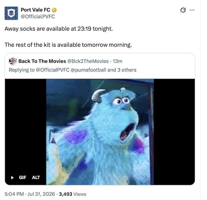
So, is Port Vale’s new away kit secretly inspired by Sully from Monsters, Inc.?
Almost certainly not.
But if you find yourself expecting Mike Wazowski to appear alongside the team before an away day kick-off, you probably aren’t the only one.
Whatever it is, we’re getting promoted in it! I’m keeping the faith. Up the Vale!
The socks go on sale at 23:19 this evening, with the full kit on sale tomorrow HERE